I had some fun this weekend and I will show you what came out of it 🙂
I took an old engraving again for the workshop. The original has its unique charm and I always feel some discomfort when I try to interfere in something that is already perfect. But my intention is not to "correct", but to reflect my feelings. As I wrote in a previous post, these graphics evoke strong emotions in me. They are full of contradictions - they show death, and at the same time they are full of life.
Look at him:
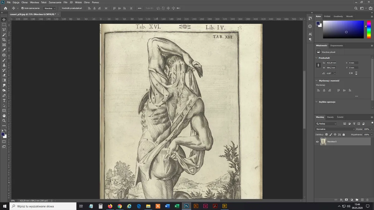
Certainly, he's already dead, yet he poses in a comfortable, almost frivolous pose. This ambiguity gave me an idea, but starting work I didn't know exactly what the final effect should be.
I started by removing the sepia color and cleaning out unnecessary "noise".

Then I started more advanced retouching. First, I cleaned the most appetizing part of the model 😆, these vertical lines disturbed my reception:
Half an hour later:
By the way, I would like to officially undermine the widespread opinion that the graphic program had magic buttons that automatically perform all possible retouching at one go. Yes, there is something like magic wand, but trust me - you would be disappointed.
Photoshop has dozens of wonderful tools that improve work and in some circumstances work miracles, but some details need to be worked longer. Especially when I work on graphics in a large format, where all the details will be visible.
Let's continue.
I wanted to clean all of these markings:

I couldn't just erase or blur it, because I was also removing/distorting other important details, see it below:

So I spent many hours working with various tools. It was like combining the work of an art restorer (cleaning and reconstructing details with a small paintbrush) with a plastic surgeon (because I also 'transplanted' tiny parts from other fragments of the image into damaged places).
Before and after (not all cleared yet):

And here it is:

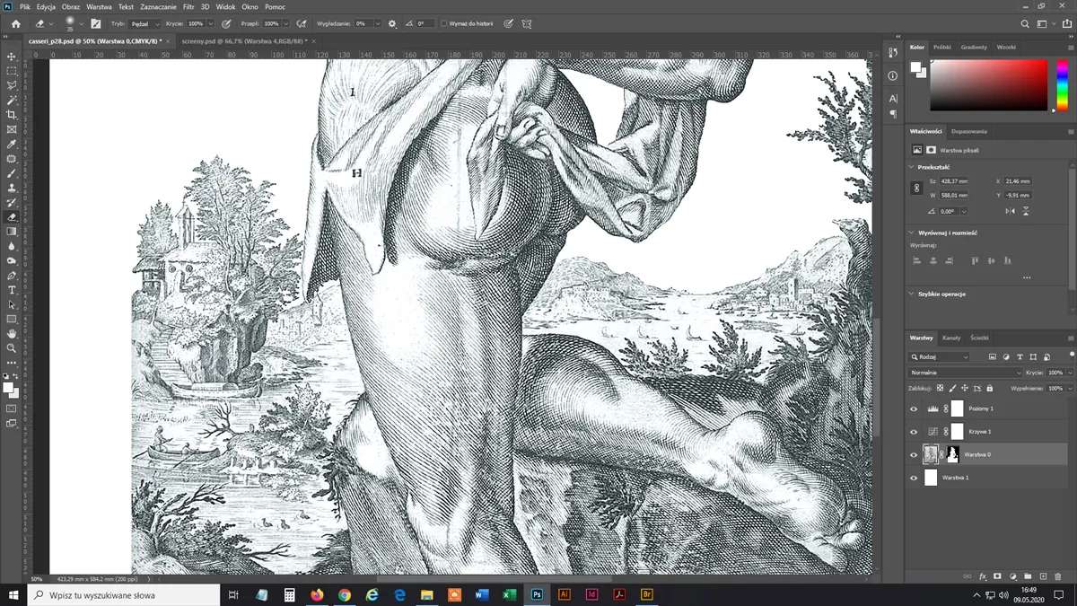
In the meantime, I decided to remove the background, although I felt a little sorry. By the way - notice that amazing attention to detail:

The picture is tiny because the landscape in the background is just an addition, but normal life goes on there!
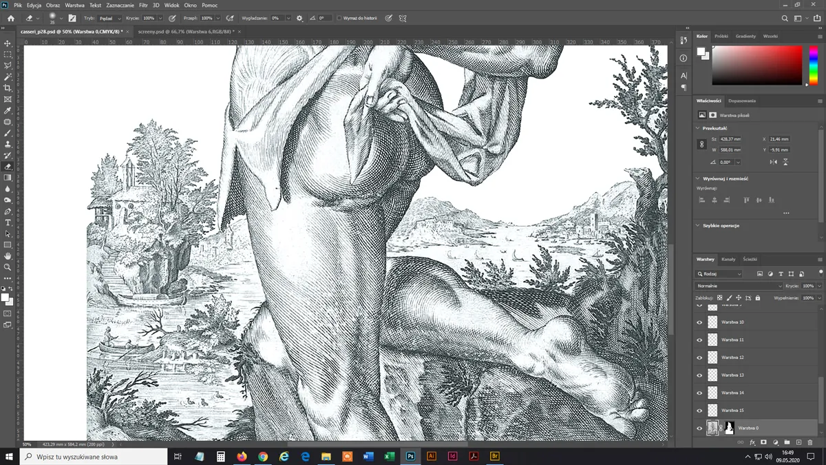
Background removed, time for coloring:

I also added frame and hatching and this is the final effect (before/after):

Nice, but I would add something.
I didn't take any shortcuts, I copied the fonts from engravings:
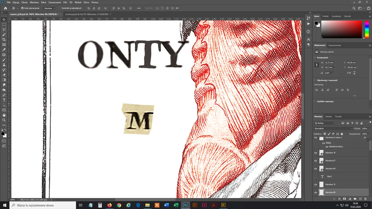

All right, I confess - I took one font from Adobe resources ... but it fits!

Ready!
I work as a marketing graphic designer... And I guess it shows!

Will you come? 😜

Seriously, time for a walk.
It took me about 15 hours (not without a break of course). I didn't count exactly. I pay attention to details so it takes time, but I like it.
In all the process, as usual, I was accompanied by music. Today's thanks go primarily to Tool and Gogol Bordello - I love you, people!
Thanks for your attention and see you soon!
The original illustration I was working on comes from centuries-old books and has been marked as a public domain graphic.
The poster visualization was made using free for commercial use mockup from graphicburger.com. I recommend this site as a great source of mockups.